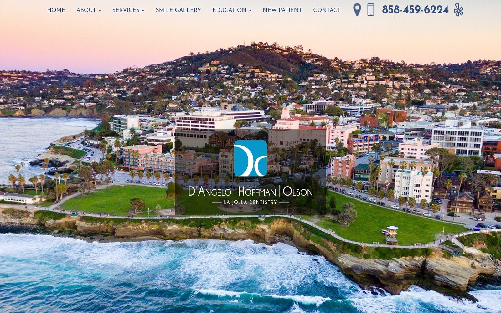
La Jolla Dentistry’s website is a direct representation of their motto: a leading visionary in dental care. By offering meticulous, uncompromising, state of the art dentistry with a commitment to patient health, La Jolla Dentistry is the people’s dentistry.
Design Overview
When you enter the website, you will notice that we focused heavily on the imagery surrounding the text. The skyline propped behind the custom-made logo is an encapsulation of the quality the team serves to each and every patient. Comprised with an optimal navigational toolbar located near the top of the webpage, it features tabs that provide information services and a before-and-after gallery for incoming patients. To complement the specialty, we featured a clean and open interface to help readers digest the educational videos and articles with ease.
Use of Color

We used a color theme of both white and blue to match the overall dentistry theme. Blue and White are standard colors for medical sites for their reputation of portraying a sense of calm, trust, and professionalism to the viewer. White also provides readers with ample reading room and an ideal background for digesting and absorbing information. Blue also compliments the surrounding oceans and landscape that manifests itself throughout the images used on the website.
Elements of Design

The images were chosen also fulfill this theme. Special effects are also implemented throughout the website to enrich the viewer’s experience when researching new information. We sought to create a website that was filled with information but not overbearingly so. We created a clean interface that would allow optimal mobile and desktop interaction without the feeling of being overwhelmed. Drop down elements are also discreetly propped throughout the site as a hint of modernism and flare. The square borders surrounding a multitude of sections on the homepage allow the quality spacing between each item.
Marketing Aspect
There are a few standard practices in the La Jolla website that helps drive conversion, starting with the striking homepage with its eye-catching hero image of the surrounding city. The constant availability of contact information means that the viewers can easily contact the office the second they decide to, without having to look around. This is further aided by the constantly-available navigation menu’s presence providing rapid navigation of the site, including to the all-important Contact Us page. The website is also equipped with ADApt technology – ensuring that potentially disabled patients get the full website experience as well. The ADA logo is conveniently located on the bottom right of each web page and allows patients that require additional assistance to adjust the text and images accordingly.
Image the Website Represents

This website represents a business in contact with its community that is both aware of and respectful of the needs of its neighbors. Throughout the site, the color use and overall design is meant to be relaxed, comfortable, and welcoming, something that the La Jolla website does quite well.