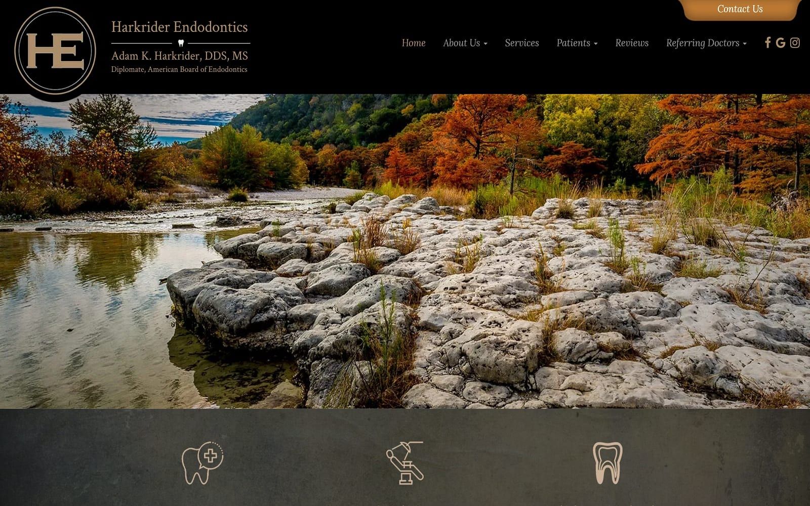
The website of Harkrider Endodontics is beautifully minimalist and direct, aimed at getting new patients in need of endodontic treatment immediately connected with the procedures that will end their pain. The information about the staff focuses heavily on their professionalism and skill in their respective practices, an essential element that helps immediately set their visitors at ease. There isn’t an emphasis on relationships because, for the patient’s sake, an endodontist hopes its the last time they see a patient, knowing they’ve sent them off to a happier life free from oral pain.
Overview Of The Design
This design leans heavily on stone elements to provide an overall sense of stability and reliability. The subtle water touch helps bring a soothing touch to the scene with its gently reflected sky. The inclusion of a well-designed, if starkly minimalist, company logo tells the visitor a great deal about the services they can hope to receive and the professionalism of the ones providing it. Information is immediately presented with little attention paid to frivolous elements like unnecessary photos. In fact, on the home page, we only get two, both displaying a contrasting scene of comfort and ruggedness.

Use Of Colors
Throughout this site, the color scheme speaks of comfort, security, reliability, and stability, the four cornerstones of the Harkrider Endodontic practice. From the black background that lends a sense of overall authority to the timeless gray, a heritage of practice is being presented to the viewer. While the clear, family-oriented focus of a general practice dental office is absent, it is replaced with a feeling of security. Those experiencing conditions that require the aid of an endodontist are often in a significant amount of pain, and that security helps soothe their concerns and reassure them that their suffering will end soon under an expert hand.
Analysis Of Design Elements
An internet search for an endodontist is rarely preceded by good news, and gaining the visitors’ confidence quick is essential. The overall design is clean and practical, with information made immediately available, with few frills getting in the way of the straight-forward functioning of this design. Contact us at the top, procedures at the bottom, this site is aimed at drawing the patient in and putting an end to their pain.

Marketing Aspect
From a marketing standpoint, this website is designed to create an air of authority, a sense that visitors need when selecting their providers for treatments like these. The information presented on the site includes the crucial elements of location and time, as well as the services that are most commonly required by those seeking these kinds of treatments. To continue that theme of reliability and authority is a list of organizations that the provider is a part of or endorsed by.
Having trouble bringing in new patients to your office? Read our short blog on 5 Ways to Get New Patients to Check Out Your Dental Website!

The Image this Website Reflects
Visitors to this website are going to immediately understand that the provider it represents is an authority in his field and able to bring them the relief their seeking. The site is highly professional without being unapproachable and delivers a distinct impression that when you come to visit, it’s going to be time to get down to business and end your pain. Subtle touches are essential, which is why stone and dark colors are central themes here. Stability, reliability, and authority, all wrapped up in one package.
Here are some other examples of websites Optimized360 has successfully delivered to their clients that implement a dark color scheme: