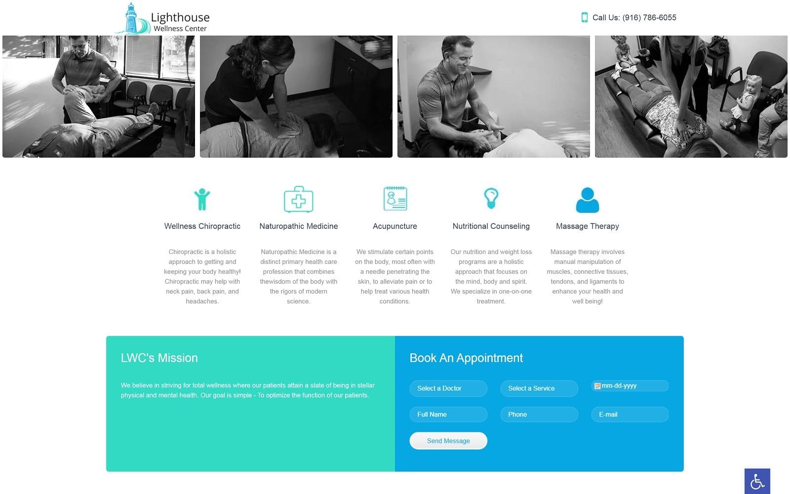
Overview of the Design
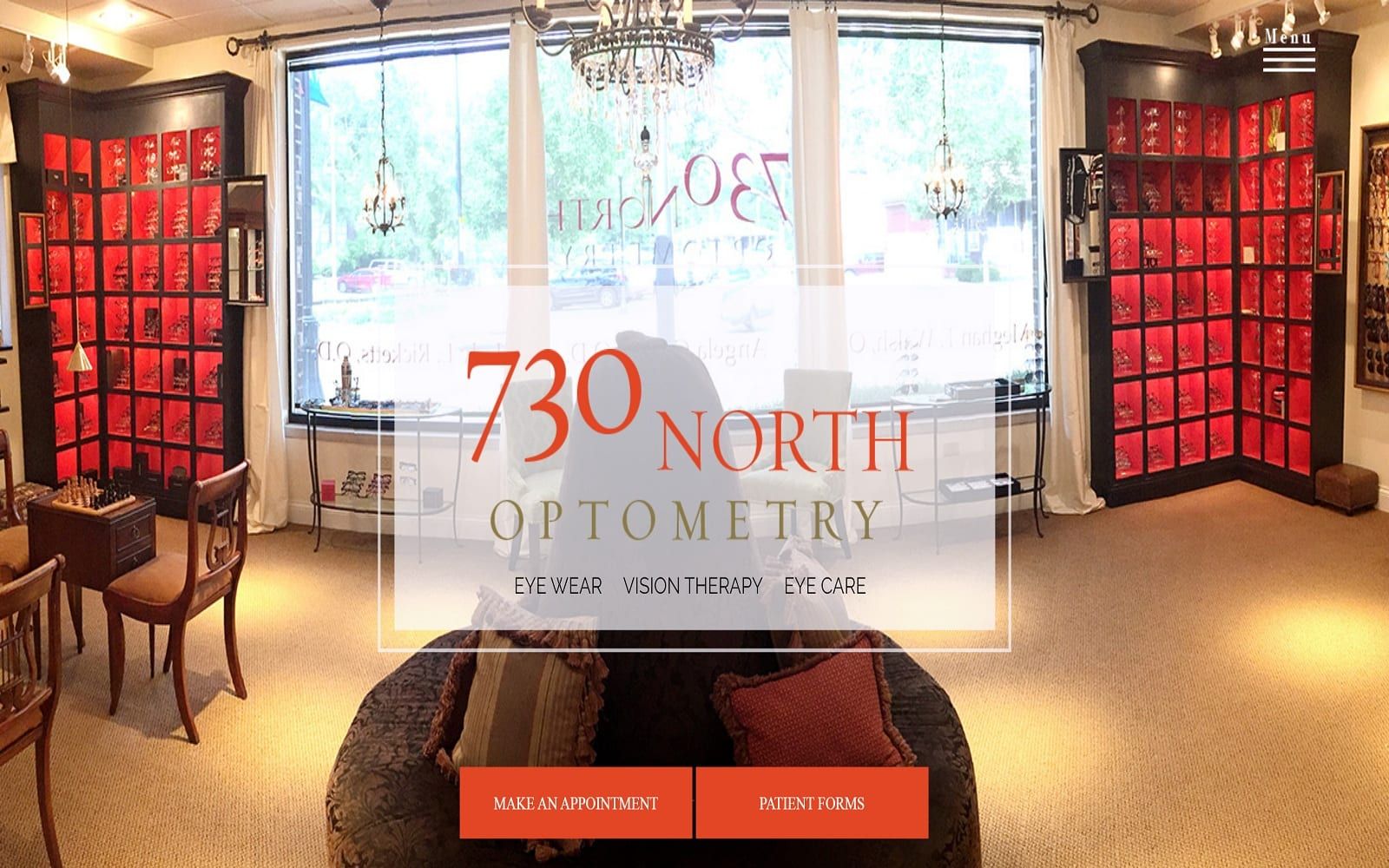
We attempt to capture the image and stature of every practice we serve here at Optomized360. For 730 North Optometry, that takes on a unique meaning since unlike many other practices, this one operates as both a vision care center and a retail shop. Our goal was to create a custom optometric website that depicts a visit at 730 North Optometry as more of an all-inclusive luxury experience rather than just another visit to the eye doctor.
For this design, we spotlighted the beautiful office itself, from the ornate chandelier that hangs in the lobby area to the plush opulence of the seating area. Visitors are given the choice to immediately explore three sections of the website based on their interests and needs – vision care, vision therapy, and eyewear. From there, we offer a brief introduction and history of the practice, followed by links to other pages within the website that describe more about the practice and all that it has to offer.
Use of Colors
Brown and orange were chosen for this custom optometry website to maintain uniformity with the existing branding. Not only do these colors match the 730 North Optometry logo, but they also reflect the colors used to decorate the practice itself. Together, they are both easy on the eye, as well as memorable for potential patients and customers who may be exploring competitors within the local area. The color palette chosen is the optimum combination of soft and bright giving a soothing essence to the whole website. It gives a sense of security and at homely vibe.
Analysis of Design Elements
Since 730 North Optometry is a modern, fashion-forward practice and eyewear shop, we wanted to implement modern design elements, such as a small upper corner menu. This allows the site to force the reader’s attention in a specific direction rather than encourage casual site navigation. It also helps ensure that the viewer gets a complete understanding of the practice’s image and mission before exploring any further. When users do click the small menu, a large translucent menu suddenly appears, taking up the entire page.
A parallax scroll allows foreground homepage text to scroll over the large header image that doubles as a background. This lends depth to the website and a three-dimensional effect. Finally, links to the practice blog allow for greater exploration of the practice and a way to stay connected between appointments.
Marketing Aspect
This website is an important part of 730 North’s Optometry marketing plan. It is a digital extension of the office itself, with highly visual marketing techniques. Though there is minimal text on the website, we did include an extensive testimonial section that highlights real patient reviews in a unique way. Also, the contact page provides both an office phone number and an appointment request form for easy scheduling.
Image the Website Reflects
This website reflects the luxury and opulence of the practice it represents. We included much more imagery on this website than a typical custom medical website, primarily because the optometric field is highly visual in and of itself. Pictures throughout the site – specifically the home page – reveal beautiful eyewear, advanced equipment, a comfortable office space, and personalized care for all ages.
Website Designed by Optimized360
New design idea