Vision is a huge part of our everyday life. Vision controls how we perceive new information, old information, and adaptations within our daily activities. Victory Eye Care understood this, as a team of optometrists. We took it upon ourselves to create a custom site design that would highlight the team’s dedication to providing crystal-clear vision.
Overview of the Design

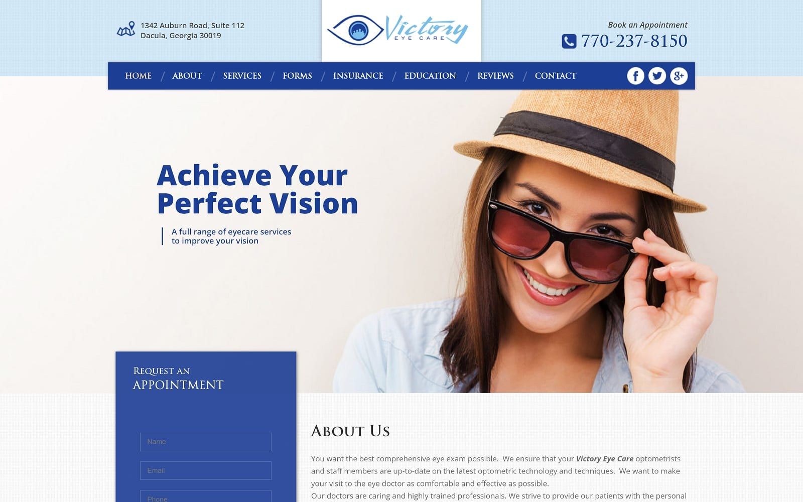
This optometry website sports a traditional layout with a traditional upper navigational menu bar. We also included an informational footer on every page that includes contact information, office hours, and the ability to book an appointment from any page on the website. The home page includes a brief welcome from the practice followed by a listing of some of the services offered. For those looking for more in-depth information, the dedicated patient education section links to informational articles describing some of the services offered by the practice.
Use of Colors

We are very selective when choosing a color scheme for a custom optometry website. In this case, the colors we chose correlate to the practice logo. In addition, the crisp royal blues contrast against a white background to imply clarity. Together, these colors mimic the hues of healthy blue eyes and the transparency of the lenses prescribed by the practice.
Blue also insinuates a feeling of hope and relief in the site visitor. White space in the background provides a sense of professionalism and care from the optometry team.
Analysis of Design Elements
Though modern, we kept the design of this website more traditional and informational with fewer ‘special effects’. The integrated appointment request form appears to stand out from the rest of the page background and text, and the image-based menu at the bottom of the home page spotlights some of the services offered by the practice. For the convenience of patients and greater efficiency in the office, we also included downloadable patient information forms directly on the website. To harmonize typography with visuals, we integrated square borders throughout the website.
Marketing Aspect

One of the most prominent features on this website is the appointment request form, which stands boldly on the left side of the home page. Below it, we created a direct link for patients to order contacts. These two features provide an instant call to action for new and existing patients who do not desire additional information about the practice. We also included social media links that make it easy for new, existing, and future patients to follow the practice on Facebook, Twitter, and Google Plus. Finally, we made it easy for current patients to share their great experiences by leaving a review directly on the website.
Image the Website Represents
When building a custom website for optometry practices, we understand the importance of a visually appealing site. The images on this website are all about vision, with pictures of healthy eyes, lenses, fashionable frames, and even prescription sunglasses adorning the page. Since this is a full-service optometry office, we used images to promote some of its specialty services, including optometry for children, comprehensive eye exams, and even Ortho-K.
Website Designed by Optimized360