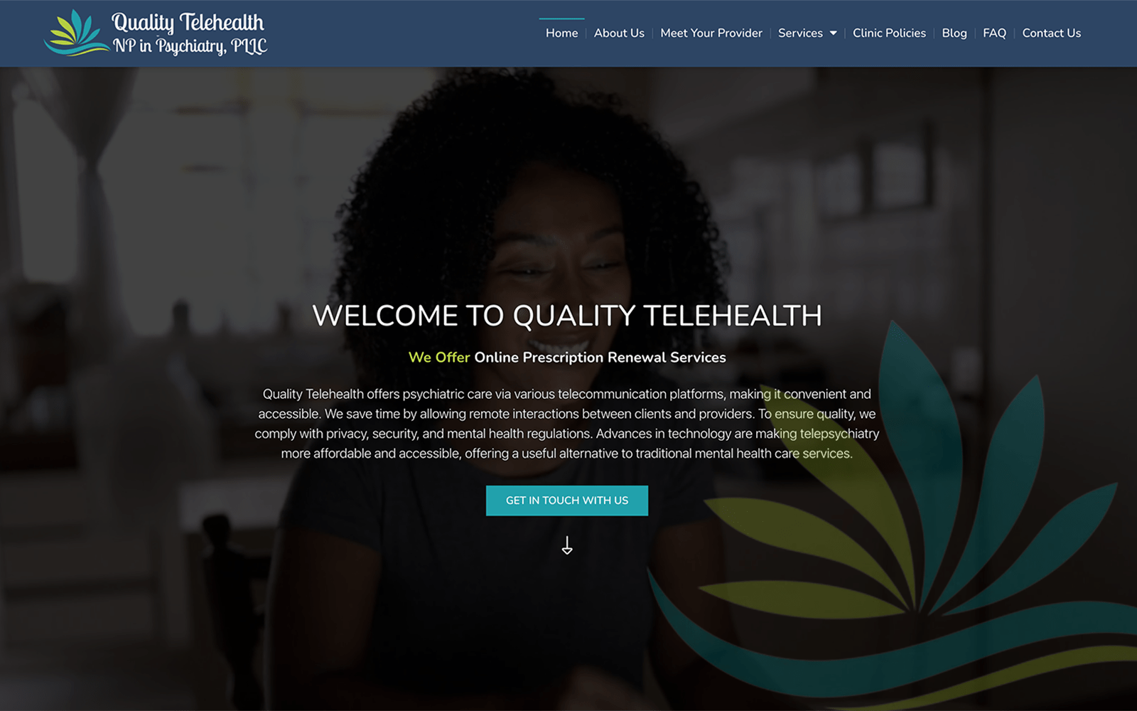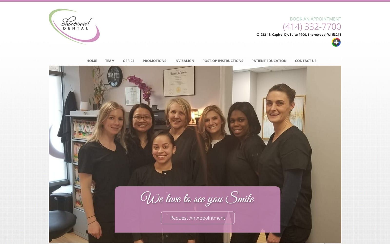
Shorewood Dental was looking for an upscale flair to their website design, without going over the top into an unapproachable and perhaps stodgy design. With the bright pink and white colors and the choice of images, we worked to create this beautiful website. Part salon, part spa, part dental office, this website shows the prospective client that you don’t just visit Shorewood for routine care; you go there to be beautiful.
Overview Of The Design
![]()
The Shorewood Dental logo has a decidedly spa-like element to its design, something that speaks more of a place you go to improve your appearance and enjoy a day of luxury than a grueling visit to the dentist. The bright smiling woman against a warm diffuse background adds to this design, her gaze and mood being relaxed and soothed rather than excited or anxious. Below that welcoming smile is an invitation to set up an appointment, with a slogan that says they want their patients happy and proud of their results.
Use Of Colors
Subtle greens, soft pinks, beautiful yellows, and a white background all come together to continue the goal of presenting Shorewood Dental as a place you go for a relaxing day at the spa, not a tension-filled stop by the dentist. The use of pink is comforting and inviting, reminiscent of beauty and joy, and brings these sensations to the web visitor. The sage green tones are used to bring in an undertone of natural gentleness, reinforcing that spa image as a compliment to the warm confidence building yellows. White has an association with professionalism and purity that are so important in a spa visit, and just as important in a dental one.

Analysis Of Design Elements
From the text of the website to the warm, welcoming color scheme, everything about this site’s design is intended to gently encourage the visitor to make an appointment and start feeling better about themselves. Unlike a typical dental approach, this website’s approach is all about encouraging the patient to feel better about themselves, to spend some time on self-care and beautification that’s more than just ‘maintenance’.

Marketing Aspect
This website makes it clear that the clinic is about two things, relationships with the patient and the patient. Everything on the landing page is aimed at being convenient and accessible without appearing pushy. The phone number is provided, an option to make an appointment, information on the office, even a list of promotions being made available by the clinic. Nothing high-pressure about it, just a welcoming design subtly focused on SEO.

The Image this Website Reflects
This website reflects a clinic specifically focused on taking a new approach to dentistry, one that’s focused on appearance and beauty, self-care and comfort, over traditional maintenance and preventative care. These procedures and options are available, of course, but that’s not what the client wanted to focus on. Instead, they wanted visitors to see a more beautiful smile, a return of confidence, and a comfortable experience spent pampering themselves with a new look.
Shorewood Dentist Designed by Optimized360