Lighthouse Wellness Center is an alternative and holistic healthcare facility with multiple onsite physicians and a wide range of services. We wanted to build a custom alternative health website that would appeal to the needs and concerns of potential patients who are either looking for whole-body based care or otherwise exploring alternatives to traditional medical care.
Overview of the Design
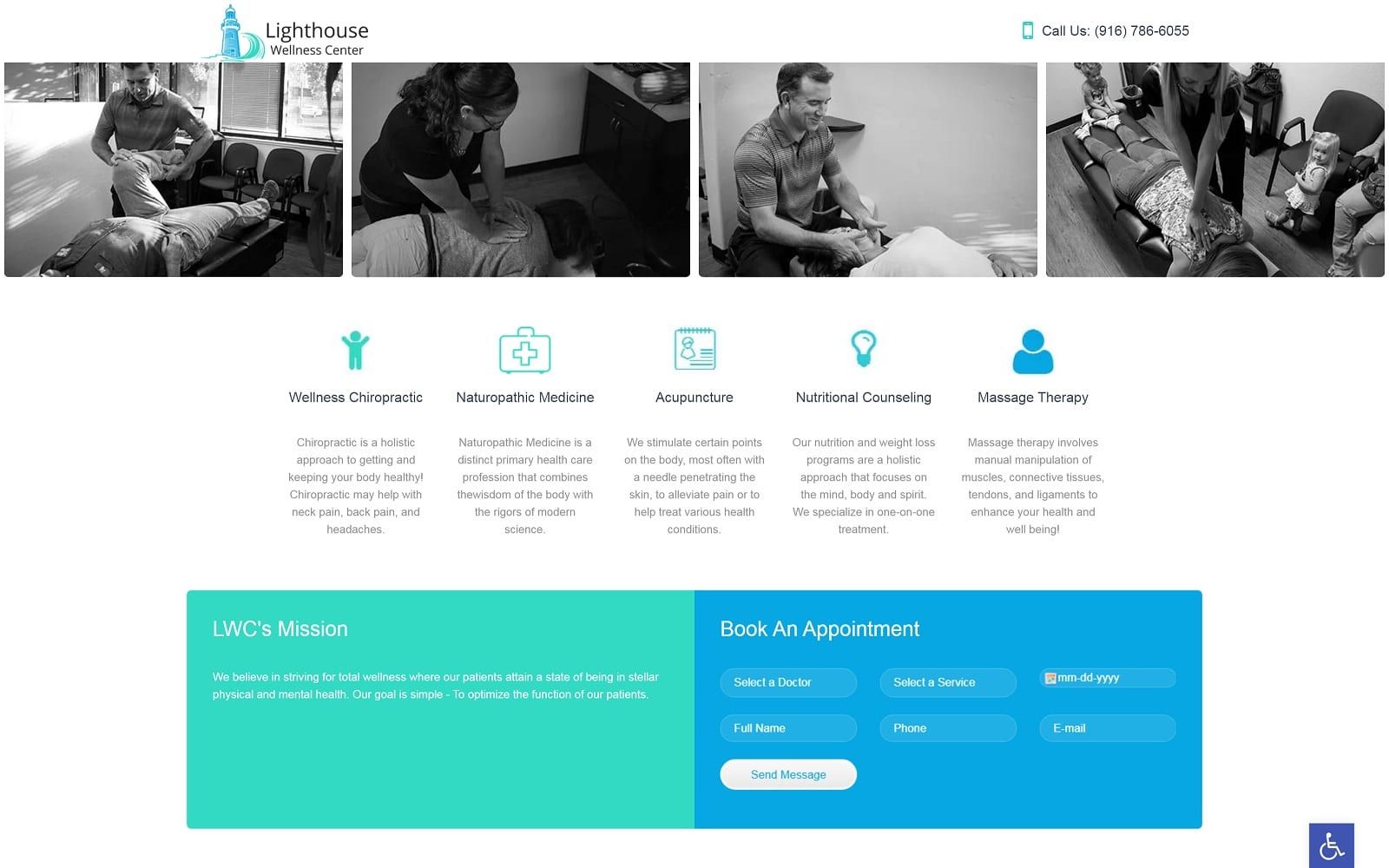
For this website, we avoided header stock photos and instead spotlighted actual pictures of patients being cared for at Lighthouse Wellness Center. A traditional navigational menu anchors the top of the home page, and a spotlighted services section allows for rapid navigation to specific areas of interest within the website. Moving down the home page, we introduce visitors to the staff, followed by highlights from the latest on the practice blog reel. Throughout the rest of the website, visitors will find additional information about the practice, a more formal introduction to the team, and a link to download patient forms for a more expedited in-office experience.
Use of Colors

As a wellness-based practice, Lighthouse Wellness Center believes in the power of the body to heal itself when properly equipped to do so. We chose blue and green set against a bright background of white for this website not only because the colors invoke positivity, but also because they are reminiscent of the ocean – an ode to the practice name.
Green insinuates the feeling of comfort and health, while blue soothes and calms the incoming visitors. Combine the two colors with a white background that provides a sense of professionalism, and you have a color theme that will surely reel in (pun intended!) new patients from around the world!

Analysis of Design Elements
This is a mostly traditional holistic web design with a few modern elements. Because the practice staff and physicians spend a lot of time educating their patients about health and wellness, we created a clean space that facilitates the sharing of information. As users scroll down the home page, the enlarged logo at the top of the screen appears to get smaller and real patient reviews begin to scroll horizontally.
Marketing Aspect

This website utilizes the benefits of social media by linking directly to the practice’s accounts. The website also features a direct calling feature, as well as the ability to request an appointment directly from the website. The blog also provides insight from the practice with helpful tips and information about special services. Finally, the patient reviews section provides testimonials from real patients who have been satisfied with their experiences.
Image the Website Represents

Pictures of real patients and care providers at Lighthouse Wellness Center can be found throughout the website. The overall look of this site shows that with a little hard work and the care of Lighthouse Wellness Center, a healthier, more fulfilling and pain-free life may be possible.
Lighthouse Wellness Center Website Designed by Optimized360;Dr. Wimbs wanted a chiropractic website that focused on the Wellness portion of her practice. In order to be consistent with her brand, we went with a color scheme that matches Lighthouse Wellness Center’s logo. The light blues and semi-opaque graphic elements give the design a fresh spirited feeling you would expect with a site focusing on wellness.
A traditional sidebar was used to help organize all the important information in one place while putting a heavy emphasis on the branding/logo of Lighthouse Wellness. The execution of a semi-opaque overlay on a full-width image gives it a modern twist on what would be a traditional design element.